R Shinyで、クラスタリングアプリ開発
はじめに
業務において、「コーディングなしで、手軽にクラスタリングを試したい。無料ソフトで…」というアナリスト・マーケターの方は、少なくないのではないでしょうか。
本日はそんな方のために、(私のShinyの勉強も兼ねて、)手軽にクラスタリングを試せるアプリをShinyで開発したのでご紹介です。
クラスタリング手法はK-means法を用いましたが、少しいじれば他の手法にも変更できます。
Shinyについて
Shinyは、Rで簡単にアプリケーションが作成可能なパッケージです。
作成したアプリをサーバーにのせてwebアプリ化すると、Rをダウンロードしていない人でも実行が可能になるのですが、今回はwebアプリ化はしていないため、使用するPCにR studioが入っている必要があります。
webアプリ化する方法については、今後記事にする予定です。
完成品
今回は、以下のようなアプリを作っていきます。
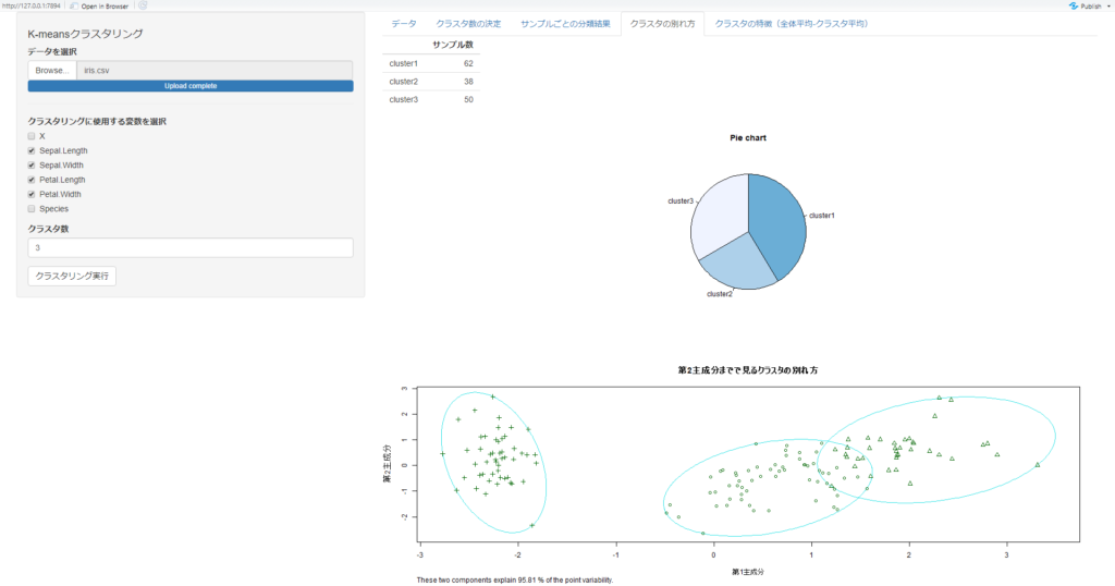
アップロードしたデータに対して、クラスタ数を変化させながら、実行結果を確認できるアプリにしています。
右上のタブを選択して、アウトプットを様々な視点から確認できるものになっています。
クラスタリングに使用する変数やクラスタ数を変化させながら、結果を確認できるものになっています。
実行にはコーディングは不要ですが、Rはインストールされている必要があります。
準備
Shinyでは、2つのRファイルを用います。"ui.R"と、"server.R"です。
サンプルデータとして、 irisのデータを使います。
Rに元から入っているものを write.csv()で出力して頂くか、以下からダウンロードしてください。
また、実行前に、"shiny", “cluster"、という2つのパッケージを以下のプログラムでダウンロードしておいてください。
install.packages("shiny")
install.packages("cluster")
プログラム
まずは全プログラムを記載します。結果のみで良いという方は、こちらをご利用ください。
プログラムは、sever.Rとui.Rを同一ディレクトリに保存頂き、下記画面右上のRun appボタンを押して頂くと実行できます。
以下が、プログラムとなります。
library(shiny)

shinyUI(fluidPage(
    sidebarPanel(
        h4("K-meansクラスタリング"),
        fileInput("file", "データを選択",
                  accept = c("text/csv", "text/comma-separated-values,text/plain", ".csv")
        ),
        tags$hr(),
        htmlOutput("colnames"),
        numericInput("number", "クラスタ数", 3, min = 1, max = 20),
        actionButton("submit", "クラスタリング実行")
    ),
    mainPanel(
        tabsetPanel(type = "tabs",
                    tabPanel("データ", tableOutput('table')),
                    tabPanel("クラスタ数の決定", textOutput("explain_elbow"), plotOutput("elbowplot")),
                    tabPanel("サンプルごとの分類結果", tableOutput("result_table")),
                    tabPanel("クラスタの別れ方", tableOutput("n_sample_table"), plotOutput("piechart"), plotOutput("result")),
#                    tabPanel("クラスタの別れ方", tableOutput("n_sample_table"), plotOutput("result")),
                    tabPanel("クラスタの特徴(全体平均-クラスタ平均)", tableOutput("diff"))
        )
    )
))
library(shiny)
library(cluster)
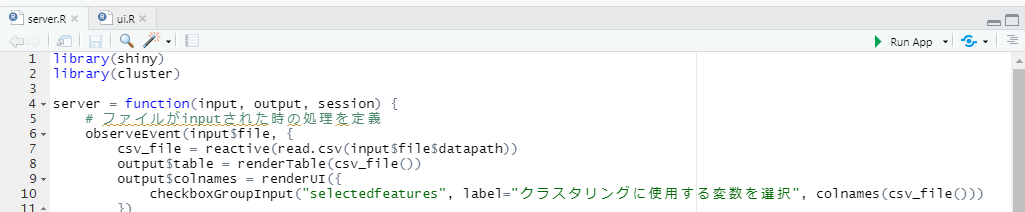
server = function(input, output, session) {
# ファイルがinputされた時の処理を定義
observeEvent(input$file, {
csv_file = reactive(read.csv(input$file$datapath))
output$table = renderTable(csv_file())
output$colnames = renderUI({
checkboxGroupInput("selectedfeatures", label="クラスタリングに使用する変数を選択", colnames(csv_file()))
})
})
# クラスタリングが実行された時の処理を定義
observeEvent(input$submit, {
csv_file = reactive(read.csv(input$file$datapath))
data = csv_file()[input$selectedfeatures]
## エルボープロットの計算
set.seed(0)
wss <- sapply(1:10, function(k){kmeans(data, k, nstart = 50, iter.max = 15)$tot.withinss})
## Userが指定した数値でクラスタリング
result = kmeans(data, input$number)
cluster = result$cluster
means = apply(data,2,mean)
diff = data.frame(result$centers - means)
rownames = NULL
for(i in 1:input$number){
rownames = append(rownames, paste("cluster",i, sep = ""))
}
rownames(diff) = rownames
# 結果出力
## エルボー法
output$elbowplot = renderPlot({
plot(1:10, wss, type="b", pch = 19, frame = FALSE, xlab="クラスタ数", ylab="クラスタ内誤差", main="エルボープロット")
})
output$explain_elbow = renderText(
paste("誤差がガクッと小さくなる部分をクラスタ数とするのが、エルボー法の基本です。")
)
## サンプルごとにクラスタ割り当てを確認
output$result_table <- renderTable({
data.frame(cbind(csv_file(), cluster))
})
## クラスタの別れ方を確認
n_sample_table = data.frame(result$size)
rownames(n_sample_table) = rownames
colnames(n_sample_table) = "サンプル数"
output$n_sample_table <- renderTable(n_sample_table, rownames=TRUE)
output$result <- renderPlot({
clusplot(data, clus=cluster, lines=0, main="第2主成分までで見るクラスタの別れ方", xlab="第1主成分", ylab="第2主成分")
})
output$piechart <- renderPlot({
cols = colorRampPalette(c("#6baed6","#eff3ff"))
pie(result$size, labels = rownames, col=cols(input$number), clockwise=T, main="Pie chart")
})
## クラスタの特徴を確認
output$diff <- renderTable(diff, rownames=TRUE)
})
}以下では、プログラムの解説をしていきます。
UI側(ui.R)について
fileInput("file", "データを選択",
          accept = c("text/csv", "text/comma-separated-values,text/plain", ".csv")
),
上記で、csv形式のファイルを受け取る機能を作っています。
これは、"file" という処理として、server側に伝わります。
numericInput("number", "クラスタ数", 3, min = 1, max = 20),
actionButton("submit", "クラスタリング実行")
こちらは、クラスタ数を決定する部分です。
クラスタ数を決定して実行ボタンを押すと、"submit" という処理が起きた事がserver側に伝わります。
mainPanel(
  tabsetPanel(type = "tabs",
              tabPanel("データ", tableOutput('table')),
              tabPanel("エルボープロット", plotOutput("elbowplot")),
              tabPanel("サンプルごとの分類結果", tableOutput("result_table")),
              tabPanel("クラスタの別れ方", plotOutput("result")),
              tabPanel("クラスタの特徴(全体平均-クラスタ平均)", tableOutput("diff"))
  )
)
mainPanel()内では、server側から受け取った、"table", “elbowplot"…というような変数を表示する処理を行っています。
サーバー側(server.R)について
サーバー側は、データがアップロードされた時の処理と、クラスタリングが実行された時の処理の2つに分かれています。順に見ていきましょう。
データがアップロードされた時に実行される処理
observeEvent(input$file, {
  csv_file = reactive(read.csv(input$file$datapath))
  output$table = renderTable(csv_file())
  output$colnames = renderUI({
    checkboxGroupInput("selectedfeatures", label="クラスタリングに使用する変数を選択", colnames(csv_file()))
  })
})
上記は、"file" という処理が起こった時に実行されるフローです。
まずはアップロードされた変数をcsv_fileという変数で読み込み、UI側に、"table" という変数で送ります。
次に、csv_file内にあった変数を、selectedfeaturesという変数に格納し、UI側に、colnamesという変数でおくります。これにより、ファイル内の変数がチェックボックスとなってUI側で表示されます。
クラスタリングが実行された時の処理
observeEvent(input$submit, {
...(省略)
こちらは、UI側で “submit" という処理が起きた時に実行されるフローです。
各処理の結果を、"output$" に続く部分、"elbowplot" や、"result_table" という変数に格納して、UI側に渡しています。
後はこれらを、UI側で表示するだけです。
※ k-means関連のプログラムについては、説明は割愛します。
ご要望があれば、別で記事にしようと思います。
おわりに
いかがでしたか。
私はShinyを使うのは初めてでしたが、短いプログラムで、非常に簡単にクラスタリングアプリを作る事ができました。
普段プログラムを書かない人にとっては、このような簡易的なアプリでもありがたがられる事があります。
利用頻度が高い分析は、このようにアプリ化しておいても良いかもしれません。
参考文献
・https://shiny.rstudio.com/
・https://www.randpy.tokyo/entry/shiny_19